Dog Blog

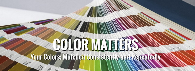
Color matters. The graphic artists at the Black Dog Sign Company have taken the discussion about color choices to a level that few other full-service sign shops ever explore. If you are unsure about the importance of color matching in the sign industry, imagine the day that you decide to upgrade your building sign. Perhaps you commissioned channel letters and wanted to replace the facings. The polycarbonate must feature the right color that is the standard of your online business persona.
 But when you shop around for a bid, your idea of tile blue is another person’s interpretation of a marina tone. Unless there is a standard that applies across the board, you may end up with a sign that looks great but is a shade, tone, or hue off from your actual corporate color. Since the building sign is the face of your business, this major mistake adversely affects brand recognition and product awareness. So, how do we keep from making these errors and ensure that we are on the same page as you whether you need tile, dazzling, or marina blue?
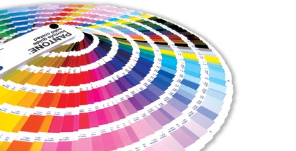
- Say it in Pantone. The Pantone Matching System is the gold standard of color names and definitions. It is our authority when it comes to parsing a shade of blue. When you initially commissioned your sign and received proofs featuring Pantone color names, it is easy for us to recreate the exact color.
- Light matters. Colors look differently in natural light than they do under the shop lights. We illuminate our shop when handling swatches and ensure that you, our client, and our graphic artists look at the same sample in identical conditions. This is crucial for the business owner who is selecting the first set of corporate colors.
- Comparing apples to apples. We frequently hear folks tell us that we should just match the look of their website’s setup. Although this is possible, consider that the worlds of graphic art and website building operate on different color terms. Printers talk about cyan while website builders refer to blue. Before we choose the color, we request that you approve the selection to ensure that we matched the online presentation of your brand correctly.
 Understanding the importance of color matching in the sign industry is the hallmark of a superior sign shop that not only specializes in the mechanics of building letters and installing components but also focuses on the artistry of the color play that is an integral part of brand portrayals. Our experts serve the business communities in and around Alpharetta, Johns Creek, Lawrenceville, Duluth, Norcross, Suwanee, Milton, Cumming, and Sugar Hill, GA. We work with the entrepreneur who is outfitting a first storefront location as well as the franchisee whose contractual obligations include a perfect color match for all signage solutions used at the site.
 We routinely work with business owners who are undertaking a rebranding that includes a change in color as well as font. Our experts also help companies to upgrade old signage and recreate the original look down to the perfect shade of the brand’s color. Contact us today to get started on your color match!


